Mixing color table. How to get orange color by mixing paints
Knowledge of color mixing options can be useful not only in professional activity artists. The individual design of living space often raises the question of how to achieve this or that interesting halftone before the designer. The proposed combination options and the color mixing table will help you get the desired effect.
Everyday life is filled with the widest range of all kinds of colors. To get the right one, you need to know the intricacies of combining.
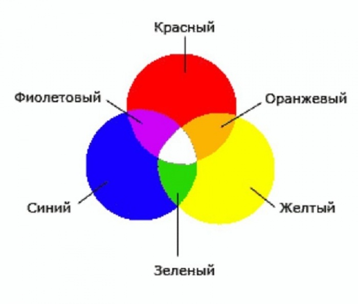
Blue, red and yellow paint are three pillars on which a wide palette of halftones rests. It is impossible to form these colors as a result of mixing other colors. At the same time, their combination with each other gives an unusually many combinations.
Important! Create Diversity different shades by mixing only two colors is possible by changing their proportions.
Depending on the volume of one part of the paint added to another, the resulting result approaches one or another original color. One of the most famous examples is the mixing of blue and yellow, resulting in green. The result obtained when adding new portions yellow paint will gradually change, as close as possible from green to yellow. You can return to blue by adding more of the original element to the green mixture.
Mixing chromatic colors that are close to each other on the color wheel gives a paint that does not have a pure tone, but has an expressive chromatic tint. Combining colors on opposite sides of the chromatic circle will result in an achromatic tone. An example is the combination of orange or magenta with green. That is, a mixture of colors closely spaced in the color wheel gives a rich chromatic hue, the maximum removal of colors from each other when mixed leads to a grayish tone.

Separate paints, when interacting, give an undesirable chemical reaction, which may result in cracking of the decorative layer. In some cases, the resulting background may darken or gray. A good example is a mixture of white lead and red cinnabar. Attractive pink color darkens over time.
It is optimal when the impression of multicolor is achieved by mixing the minimum number of colors. At the same time, it is important to consider which paints, as a result of mixing with each other, give a stable result, and which ones cannot be combined. The knowledge gained allows us to exclude from the work the paints that fade or darken in the future.
The table of undesirable mixtures below will help reduce the risk of erroneous combinations:
Having tried the above examples in practice, future painters and designers will gain valuable professional experience.
Methods for obtaining red and its shades
Red is one of the top three primary colors and is always present even in the smallest sets. But for mass printing, magenta tone is used. The answer to the question of how to get red is quite simple: mix the proposed magenta with yellow in a 1: 1 ratio. There are other options to get red when mixing paints:

In the center is the main red. Next are the mixing options. The next circle is the result of combining the first two colors. In conclusion, color options are presented when added to last result red, black or white paint.

Blue and its shades
Blue belongs to the primary colors, so blue paint is required to form all its shades.
Attention! No combination of other colors gives a shade of blue, so the presence of this paint in the kit is mandatory.
Even with a set of 12 colors available, the question periodically arises of how to get Blue colour. The classic tone is called "royal", and in the kit acrylic paints often the main color is ultramarine, which has a bright dark shade with a purple undertone. To achieve a lighter effect, mixing blue and white in a ratio of 3: 1 allows. An increase in white leads to a lighter tone up to sky blue. If you want to achieve a moderately saturated result, dark blue paint mixed with turquoise.
What colors need to be mixed to get shades of blue, consider below:
- The effect of a dark blue-green tone is achieved by mixing blue and yellow paint in equal proportions. The addition of white paint will result in a lighter hue with a simultaneous decrease in brightness due to the combination of 3 elements.
- Prussian blue is created by mixing 1 part of the main blue and adding 1 part of the composition of bright green and light green. A rich and deep shade can be diluted with white, and its purity will not change.
- The combination of blue and red in a ratio of 2:1 gives blue with a hint of purple. Adding white allows you to lighten a dark and saturated tone.
- The brightness of royal blue is different, a similar effect is achieved by mixing the main blue with magenta pink in equal parts. The admixture of white traditionally brightens the result.
- The combination with orange gives a gray mass. Replacing orange with brown at a ratio of 1:2 to the base creates a dark color with a complex gray-blue tint.
- The formation of dark blue is done with the help of black admixture in the ratio of 3:1.
- Mixing the base color with white allows you to create a blue tone on your own.
A small table of combination options is presented below:
green color palette
Solving the problem of how to get green in case it is not in the set is quite simple: connect yellow and blue. A rich palette of green halftones is created by changing the proportions of the original components and adding additional elements that perform the function of darkening or lightening. This role is played by black and white paint. The effect of olive and khaki is achieved by mixing the two main elements (yellow and blue) and a slight admixture of brown.
Comment! The saturation of green depends entirely on the quality of the constituent elements: the intense tones of the source guarantee a bright result.
If green is obtained by mixing, then all subsequent midtones will be dimmer. Therefore, it is better to experiment with a gamut of green, having an initially ready-made primary color. There are many combination options:
- The combination of equal proportions of blue and yellow gives grassy green.
- Increasing yellow to 2 parts with the addition of 1 part blue results in a yellow-green effect.
- Experimenting on the contrary in the form of a blue-yellow ratio of 2: 1 will produce a blue-green tone.
- If you add ½ of black to the previous composition, you will achieve a dark green effect.
- Light green warm tone is formed from yellow, blue and white paint in a ratio of 1:1:2.
- For a similar light green shade, but a cold tone, you need to take yellow, blue and white bases in a ratio of 1:2:2.
- Dark olive color is formed by mixing in equal parts yellow, blue and brown paint.
- A gray-brown tone is obtained from similar elements in a ratio of 1: 2: 0.5.
The expressiveness of the green color is directly dependent on the original elements, respectively, the brightness of the midtones is repelled by the saturation of the green. A visual representation of the blending options is given by the graphic palette:

As in the case of the red circle, the main paint is located in the center, followed by mixing options, then the result of the experiments. The final circle is the shades of the previous level when adding the main, white or black paint.

Other combination options
There are many other tricks to create the desired effect by adding some kind of dye to the base color. The answer to the question how to get the color Ivory multifaceted and depends on the surface where it is planned to apply the paint. The easiest option is to mix a snow-white base base with a yellowish one. For example, yellowish ocher or a minimal amount of strontium is added to whitewash. To tint paper, a small amount of potassium permanganate is diluted in water. A light pink shade indicates a properly diluted solution. A cotton swab, brush or sponge is wetted in the resulting composition, after which the surface of the paper is processed.
Advice! For double-sided tinting, the sheet can be lowered for a couple of minutes into a container with a solution of potassium permanganate. After drying, it will acquire the desired effect of ivory.
There are also several ways to get black:
- by mixing three base colors red, blue and yellow;
- when combining cyan, magenta and yellow;
- by combining green and red, but the result will not be 100% clear, but only close to the desired effect.

We will try to answer the most popular questions about mixing options:
- How to get a crimson color: the base is blue with the addition of red, white and brown.
- You can get turquoise, the second name of which is aquamarine, by mixing blue and green. Depending on the proportions, the tones of the new shade range from soft pastels to intense and bright.
- How to get yellow? It belongs to the main ones and it is impossible to obtain it by combining other paints. Something similar to yellow can be created with watercolors by combining green and orange or red. But it is impossible to achieve purity of tone in this way.
- How to get brown shade? To do this, you need basic paints: red, yellow and blue. First, a small amount of yellow is added to the red (in an approximate ratio of 10: 1), then the volume is gradually increased until an orange tone is obtained. After that, they proceed to the introduction of the blue element, 5-10% of the total volume will be enough. Minor adjustments to the proportions will produce a wide variety of brown effects.
- The combination of black and white elements in various proportions gives a diverse range of gray tones.
As you can see, the options to achieve the desired effect in creative process designs are innumerable. A table with options for mixing colors and videos will supplement the information provided:
Decided to take up painting or painting furniture? But don't know how to get different shades? The paint mixing charts and tips will help you do just that.
Basic concepts
Before you start studying paint mixing tables, you should familiarize yourself with some definitions that will make it easy to understand a new material for yourself. The words used in the theory and practice of blending shades are explained below. These are not scientific encyclopedic definitions, but transcripts in a language understandable to an ordinary beginner, without the presence of complex terminology.

Achromatic colors are all intermediate shades between black and white, that is, gray. In these colors there is only a tonal component (dark - light), but there is no "color" as such. Those where it is are called chromatic.
Primary colors are red, blue, yellow. They cannot be obtained by mixing any other colors. Those that can are composite.
Saturation is a characteristic that distinguishes an achromatic hue from an identical lightness. Next, consider what a paint mixing table for drawing is.
Range
Paint mixing tables are usually presented as a matrix of rectangles or squares, or as color combination schemes with digital values or the percentage of each color component.
The underlying table is the spectrum. It can be depicted as a stripe or a circle. The second option is more convenient, visual and understandable. In fact, the spectrum is a schematic representation of a beam of light decomposed into color components, in other words, a rainbow.

This table contains both primary and secondary colors. The more sectors in this circle, the greater the number of intermediate shades. In the figure above, there are also gradations of lightness. Each ring corresponds to a certain tone.
The hue of each sector is obtained by mixing neighboring paints along the ring.
How to mix achromatic colors
There is such a painting technique as grisaille. It involves the creation of a picture using gradations of exclusively achromatic colors. Sometimes brown or another shade is added. Below is a table of mixing colors for paints when working with this method.

Please note that when working with gouache, oil, acrylic, more gray shade created by not only reducing the amount of black, but also adding white. In watercolor, professionals do not use this paint, but dilute
How to mix with white and black
In order to get a darker or lighter shade of the pigment that you have in the kit, you need to mix it with achromatic colors. This is how gouache works, mixing acrylic paints. The table below is suitable for working with any material.

There are in sets different amount ready-made colors, so compare what you have with the shade you want. When adding white, you will get the so-called pastel colors.
Below is how the gradation of several complex colors is obtained from the lightest, almost white, to very dark.

Mixing watercolors
The table below can be used for both methods of painting: glazing or single layer. The difference is that in the first version, the final shade is obtained by visually connecting different tones superimposed one on top of the other. The second method involves the mechanical creation of the desired color by combining pigments on the palette.

How this is done is easy to understand by the example of the first line with purple tones from the picture above. Layered execution is done like this:
- Fill in all the squares with a light tone, which will be obtained by using a small amount of paint and a sufficient amount of water.
- After drying, apply the same color to the second and third elements.
- Repeat the steps as many times as needed. In this version, there are only three color transition cells, but there may be more.
When working in the technique of glazing painting, it is worth remembering that different colors it is better to mix no more than five layers. The previous one must be well dried out.
In the event that you prepare the required color immediately on the palette, the sequence of work with the same purple gradation will be as follows:
- Set the color by taking a little paint on a wet brush. Apply to the first rectangle.
- Add pigment, fill in the second element.
- Dip the brush back into the paint and make a third cell.
When working in one layer, you must first mix all the colors on the palette. This means that in the first method, the final shade is obtained by optical mixing, and in the second - mechanical.
gouache and oil
The techniques for working with these materials are similar, since the pigments are always presented in the form of a creamy mass. If the gouache is dry, it is pre-diluted with water to the desired consistency. White is always present in any set. They are usually used up faster than others, so they are sold in individual jars or tubes.
Mixing (table below), like gouaches, is a simple task. The advantage of these techniques is that the next layer completely overlaps the previous one. If you made a mistake and after drying you didn’t like the resulting shade, make up a new one and apply it on top. The previous one will not show through if you work with thick colors without diluting them with liquid (water for gouache, solvent for oil).
Pictures in this painting technique can even be textured, when a thick mass is applied pasty, that is, in a thick layer. Often, a special tool is used for this - a palette knife, which is a metal spatula on the handle.

Proportions of mixed paints and required colors to obtain the desired shade are shown in the previous chart-table. It is worth saying that it is enough to have only three primary colors in the set (red, yellow and blue), as well as black and white. Of these, in different combination, all other shades are obtained. The main thing is that the colors in the jar should be exactly the main spectral tones, that is, for example, not pink or raspberry, but red.
Acrylic work
Most often, these paints work on wood, cardboard, glass, stone, making decorative crafts. In this case, it happens the same way as when using gouache or oil. If the surface has been pre-primed and the paints are suitable for it, getting the desired shade is not difficult. Below are examples of mixing shades with acrylic.

For (batik) are also used but they are sold in jars of liquid consistency and are similar to printer ink. In this case, the colors are mixed according to the principle of watercolor on the palette with the addition of water, not white.
If you understand how to use paint mixing charts, you can easily create an unlimited number of shades when working with watercolors, oils, or acrylics.
Hair coloring is based on a scientific basis - knowledge of color and chemical laws, the skill of a hairdresser-colorist.
Modern coloring is a fashion for uniqueness and absolute individuality
Coloring is divided into several varieties, the main of which are:
- booking;
- highlighting;
- balayage;
- ombre.
When blonding, the master carefully distributes various shades of light tones over the entire length of the hair of each strand. This look looks beautiful on blond hair.
Bronding on light brown straight hair. Results before and after staining
Performing hair highlighting, the hairdresser discolors the selected strands. The number of light strands depends on the wishes of the client and can range from 10% to more than 50%.
 Highlights on dark hair
 Sometimes for colored strands, the shades obtained during dyeing are additionally neutralized by applying the rules of color.
When carrying out the ombre technique, the master achieves a smooth transition, starting from a very dark root zone to the most lightened ends of the hair.
 Long straight hair dyed with ombre
 Features of coloring by color types of appearance
To obtain the desired tone, the paint is diluted with certain pigments:
1 pack of paint (60 ml) corrects the color with 4 grams of pigment. When you get an ugly or not the one that is desirable, experts do not recommend lightening the hair color, you get a dirty, unattractive color.
In this case, it is better to correct staining with professional craftsmen who have rich experience and the necessary funds.
Why is it important to know color theory, about color combinations, how to apply it in coloring
It is important to know! For hair coloring, mixing paints and colors, it is important to select matching tones, to combine them in exact proportions. Professionals mix paints that are similar in tone, meeting the rules for proper combination:
- copper shade with brown;
- eggplant with dark purple;
- caramel with golden brown.
It is not allowed to mix more than 3 colors of different tone. The hairstyle will gain contrast if white strands are applied to dark hair.
Note! Proper mixing of paints and colors in coloring can visually change the shape of the face, correct parts of the hairstyle with certain color shades.
Rules for mixing paints of different shades
Experienced professionals who know how to evaluate:
- hair - condition, structure;
- scalp - sensitive, dry, irritated.
Experts note 4 color types: cold - summer and winter, warm - autumn and spring.
it is undesirable to change the natural color type to the opposite.
For fair-haired women belonging to the “summer” color type, it is better to color with wheat, ashy and platinum tones. Dark-haired representatives of the fair sex belonging to this color type will suit various brown tones.

Blond hair of the “spring” color type is dyed with colors that match the natural color, golden and honey tones. For dark hair of this color type, caramel and walnut are chosen.
Bright representatives of the "autumn" are especially suited for rich tones of colors - red, golden, copper.
Experienced stylists determine the color scheme of hair dyes by the eyes.
 Owners of gray-blue eyes are most suitable for light hair tones.
 Green-eyed women are offered warm shades. If yellowish blotches are present in the iris, an orange and red palette paint is recommended. If the eyes differ in a malachite shade, a chestnut, dark blond tone is in harmony.
Light tones look beautiful with blue eyes. Brownish blotches on the iris of blue-eyed individuals suggest staining with caramel or red hues. Bright blue eyes - brown tones work well. Gray-blue is best painted in light colors.
For dark brown eyes with dark skin- chestnut or chocolate tones. If you have light skin with dark brown eyes, you should paint with red shades. For light brown eyes, golden tones are recommended.

Gray-eyed women fit all tones, but it is better not to use too dark shades.
Hair colors are mixed with palette colors similar in tone, accurate selection is carried out using the attached color shade tables.
Do not mix paints produced by different companies.
Manufacturers have their own palette, different from others. The desired result is obtained with the correct calculation of the proportion and amount of paint.
Experts recommend unevenly dyed and gray hair - first dye it in a natural color, and then select and mix shades. On hair of different types and textures, the same shades look different, and time exposure affects color saturation.
It is forbidden to dilute paint in metal dishes, suitable for glass, ceramics, plastic.
In what proportions to mix paints
Different amounts of dye are used on hair of different lengths:
- short hair - 1 pack (60 ml);
- medium hair - 2 packs (120 ml);
- long hair - 3 packs (180 ml).
To obtain the shade indicated on the package, 3% oxidizing agent is added when diluting the paint. When mixing paints for hair coloring, take them in equal proportions or add more paint, the color you want to get.
For example, when mixing caramel and golden blond, adding more golden blond, you get a richer golden hue.

Important to remember! The palettes of colors developed by the manufacturers are paints of complex tonality, containing different quantitative content of pigments: gray-green, blue, red and yellow.
The molecules of these dyes vary in size:
- The smallest molecule belongs to the gray-green pigment, coloring the hair, it is distributed in it first.
- Next in size goes blue, which will be the next to take place in the structure of the hair.
- Red is larger than the first two, it has little opportunity to take place in dyed hair.
- Most of all, the yellow pigment, it has no place at all in the inner part of the hair, it envelops its outer side. Shampoo removes yellow pigment quickly.
The composition of dyes - what is important to know?
Undyed natural hair contains 3 primary colors. Their different combination determines the natural color of the hair.
 Three primary natural colors: blue, red and yellow
 In hair coloring, when mixing paints and colors, the gamut of colors is distributed over levels from 1 to 10: starting from 1 - very black and ending at 10 - the lightest. In hair from level 8-10 there is 1 yellow pigment, from level 4-7 there is red and yellow color, brown shades are obtained.
The highest levels 1-3 have the presence of blue pigment in conjunction with red, yellow is completely absent.
Hair dyes of all manufacturers are indicated by numbers, they determine its tone:
- the first - belonging to the degree of lordship;
- the second - to the main color (up to 75% of the paint composition);
- the third is the nuance of color.
secondary colors
Mixing bordering colors acquire secondary:
- orange - yellow and red;
- purple - red and blue;
- green - blue and yellow.
Each of the 3 primary colors has an opposite color (opposite color), contributing to the neutralization of various shades:
 Each of the 3 primary colors has a counter color
 - red is extinguished by green;
- blue - orange;
- yellow - purple.
Professionals calculate and remove unsuccessful shades according to this principle.
Tertiary colors
By connecting the primary and secondary color borders, they acquire tertiary shades.
When coloring hair, mixing paints and colors, beautiful shades are obtained, for example, by combining a beige shade with a cold violet - exquisite platinum. blonde with grey-green hair correct by adding red, redness is neutralized with a tobacco tint.
Important to remember! On completely bleached hair, the desired shades are not obtained, they become lighter, for example, purple hue on white hair turns into lilac. With a slight content of yellow pigment in the hair, it comes out:
- Pink color takes on a reddish tint.
- Lilac neutralizes yellowness, platinum remains.
Darker shades come out on natural uncolored hair.
Harmonious colors
The harmony of nearby colors is the presence of one primary color. Harmonious colors are taken from the intervals of one main color to the next main color. They have 4 subspecies.
The harmony of these colors leads to balance, changing their lightness and saturation when coloring hair, mixing colors and colors. When white or black colors are added to them, the harmony of the combination occurs with the release of one saturated color.
 The Oswald circle is the basis of coloristics, which determines the laws of the formation of shades. Mixing dyes and colors to change hair color is carried out in accordance with his recommendations.
 monochrome colors
With a monochrome combination, a combination of colors of one colors, with light and saturated shades. In hairdressing, a similar calm combination is often used.
achromatic colors
The achromatic combination of colors is essentially close to the monochromatic combination; in some sources it is not singled out separately. It is based on two or more achromatic colors.
The classic combination of this harmonic series is considered to be a gradual transition from white to black. Hairstyles made in this style emphasize dignity and stability.
 Achromatic color combination
 Complex color shades each manufacturer produces using different proportions, which gives the product its own shade.
Some companies add a neutralizing pigment, but not always. The difficulty of staining with obtaining desired effect- carefully study the composition of paints.
Ash shades
Ash shades are popular in hair coloring in salons, especially with ombre.
The results of staining with ashy shades may differ from those expected. Therefore, a number of nuances should be taken into account :
- ashy shade on bleached hair looks excessively gray or dirty;
- it gives darkening to the hair;
- in the presence of yellowness creates a green tint;
- suits young girls, other women look older.
 Ash shade is most suitable for young girls
 Skillful hands of a professional will avoid side effects and get the desired result, taking into account the following features of ashy paint:
- there is a lot of blue pigment in the ashy shade;
- a feature of the paint is the presence of different shades from different manufacturers;
- ashy shades of different firms differ in pigment density;
- this paint removes the orange tint when lightening.
Before proceeding with the coloring of hair, you should determine a few points:
- correctly set the depth of the tone in the hair;
- understand what hair color the client wants to receive;
- make a decision about additional hair lightening;
- understand whether after the procedures an unnecessary shade to be neutralized is obtained, and determine the color.
 It is important to correctly determine the level of depth of hair tone
 Hair coloring, mixing several colors various colors in the hairstyle contributes to the creation of a unique individual image. This type of coloring is suitable for hair of different lengths: from short creative haircuts to beautiful curls.
Experts insist on maintaining a sense of proportion so that there are no overflows of tasteless bright spots. The theory of color, an invaluable practice that brings experience, helps the masters to maintain balance.
Qualified hairdressers warn - you can not rashly experiment without a clear knowledge of the laws of obtaining color combinations.
 Hair Color Mixing Chart
 How to properly dye your hair using the color technique
Before coloring hair, mixing paints and colors, follow the advice of experts:
- It is not recommended to use masks for a week before dyeing, as the special substances in their composition envelop the hair and can change the expected coloring result.
- The head is not washed before staining: the skin on the head will not be affected by the oxidizing agent, due to the released fat.
- Paint is applied to dry hair, wet dilute it, the color will lose saturation.
- To facilitate the distribution of the dye, the hair is divided into strands and the dye is applied evenly and quickly.
- The paint is applied again, first on the root zone, after 20 minutes, spread over the entire length.
- Perform the procedure with gloves that protect your hands.
- Wash off the paint gradually, moisten, lather. Then wash your hair with shampoo and apply balm.
Paints must be for professional use and belong to the same manufacturer .
Mixing paints and colors in hair coloring should be carried out step by step:
- Read the instructions carefully. Mix colors separately.
- Mix paints together in the chosen proportion.
- Mix composition thoroughly and distribute the mixture through the hair. The paint is applied immediately after preparation, because. the shelf life of the diluted coloring composition is short.
- keep hair dye according to the instructions, then wash your hair.

Note! divorced and mixed paints cannot be stored. After 30 minutes, a reaction with air masses will occur and the paint will deteriorate. A multi-colored mixture should be used in one go.
The records determine:
- the color you like, no need to remember - what shades were used when mixing;
- duration - how long the staining is not washed off;
- unsuitable shade - which colors should not be mixed.
Professionals warn – it is difficult to get rid of some tones of colors. First you need to remove the color you don’t like, and then dye your hair again. These actions will affect the condition of the skin on the head and hair.
After consulting with experts, you can understand which colors are more suitable for your skin type and face shape and find a special individual hair color that emphasizes a unique female image. Be healthy and beautiful!
Useful video materials on the topic: Hair coloring. Mixing paints and colors
How to mix hair dyes correctly:
A short course on the basics of color:
You can see how to choose a shade for your hair here:
Burnt sienna, ultramarine, cadmium yellow - these words sound like mysterious spells to the uninitiated ear. In fact, these are just the names of colors, although there is, of course, a certain magic in them. One has only to pick up a brush and put a few drops on the palette, as the imagination immediately comes to life. And all that remains for the artist is to mix the colors correctly in order to create real miracles.
It can sometimes be difficult for novice artists to navigate the choice of colors for their painting, especially if there are a lot of colors in their watercolor set. That is why it is recommended to buy paints with a smaller variety of shades, because it is much more interesting and, most importantly, more useful to mix paints yourself. Finished colors often turn out to be quite harsh, far from natural muted tones. But a custom-made palette will not only help you find what you need for the desired image, but also serve as a source of imagination and useful knowledge.
All shades of colors are divided into warm and cold. These names are completely speaking, warm colors are more sunny, summer: orange, red, yellow. Cold, respectively, winter, refreshing: blue, light blue, purple.
The colors on the palette interact with each other, forming absolutely incredible variations. However, there are general trends that are reflected in the so-called Itten circle. This is a model of combining primary and secondary colors.

The circle not only shows how secondary colors from the primary, but also visually divides them into warm and cold, respectively, one on the right, the other on the left. It is important to understand that we are talking about base colors, not shades. Indeed, in comparison, they alone will be warmer, others colder.

Here is a small table for mixing primary colors.


Rules for mixing paints
To properly mix watercolor paints, you need to know some of their features and be sure to take them into account when applying to paper. It's about not only about the division into warm and cold tones, but also about the hiding power of some colors, i.e. ability to overlap previous layers. Various shades are obtained not only by mixing two colors, but also by varying their quantity, as well as the amount of water used. For example, mixing the classic combination of yellow and green, with the addition of more yellow, will gradually change to a lighter light green, and may even return to the original element.
Colors that are close to each other when mixed will not give a pure tone, but with their help you can get a very expressive shade, it will be called chromatic. If you combine colors located on opposite sides of the color wheel, you can get an achromatic, grayish tone. For example, a combination of orange with green and purple will give such an effect.
Some paints, when mixed, give an undesirable reaction. It's not just about dirt in the drawing, it can lead to cracking of the paint layer, as well as darkening when it dries. The combination of zinc white with cinnabar has a beautiful light pink tone, but in the future this combination darkens and becomes inexpressive. Therefore, of course, it is considered optimal to achieve brightness and multicolor by mixing the minimum number of colors. Remember that some combinations give a lasting effect, while some are completely unacceptable.

How to get yellow when mixing paints
Yellow is one of the three basic colors, so it is impossible to get it by mixing in its pure form! However, you can achieve some result by playing with shades close to it in the palette. For example, to get gold, you need regular yellow and a drop of red or brown. A good option can also be to bring them yellow with red and the addition of white.

How to get orange color when mixing paints
Much more productive is mixing yellow paint to make orange. It is formed from a mixture of yellow and red. By adding a small amount of brown and red, you can make it tangerine or golden, depending on the amount of ingredients. A bright orange color is obtained from classic orange with brown and white.

How to get a mint color when mixing paints

How to get black when mixing paints
Each set of watercolors has a black color, but if for some reason you don’t have it, or you need it very dark shade then you can mix it by yourself. You will need to combine red, yellow and blue in equal proportions. An excellent color is obtained from blue and brown. Also suitable for mixing red, green, yellow, purple. Cobalt yellow, cobalt blue and pink madder will give a soft black color.

How to get green when mixing paints
Green is obtained from yellow and blue. However, in watercolor in its pure form, it is used infrequently. Much more popular colors are sunny green or olive green, midnight green, their combination and other options. Solar green uses ultramarine and cobalt yellow, olive is made from the same colors with the addition of burnt sienna, and midnight is made from PC blue, yellow and a dash of black.

How to get turquoise color when mixing paints
Turquoise is better known by another name, aquamarine. On the spectrum of colors, its place is between green and blue. So for mixing they will be needed. You will need a little more blue cyan than green. However, this depends on the required color intensity. For a more delicate turquoise, you can add a drop of white or light gray paint. For a rich aquamarine, you will need to take a bright shade of blue, green and a little yellow.

How to get a burgundy color when mixing paints
The burgundy color owes its name to the French wine of the same name. This color is solemn, deep, you can mix it with three parts of red and one blue. For a warmer shade, you can introduce a little yellow, or combine bright scarlet in half with brown. A colder tone will be obtained from red, brown and black, it comes out so saturated that it must be diluted with water.

How to get blue color when mixing paints
Blue color in watercolor is very easy to get, it is enough to dilute ultramarine with water properly, and it's in the bag. However, for those who are not looking for easy ways, there are always a couple interesting ways. One of them is the use of white paint: 2 parts of ultramarine will require one part of white paint. You need to dilute the blue color gradually to adjust the saturation of the tone. For a bright blue color, you need the same blue, a drop of red and white. Another shade can be obtained by adding one part of not red, but green paint to this mixture.

How to get a crimson color when mixing paints
Bright and energetic crimson color has a whole range of shades. The main can be obtained by combining red, blue and a small amount of white. To muffle too catchy color, add a little black. Instead of black, you can use brown, and instead of blue - turquoise or cyan, or purple, the results will be very extraordinary.

How to get brown when mixing paints
Get Brown color Can different ways. The simplest is mixing red and green paints. It can also be made from purple and yellow, the more yellow, the lighter the tone will turn out. Another way is to use red, blue and yellow, but you need to mix them gradually, adding new portions of paint to adjust the hue, otherwise black may form, especially if red and blue predominate. A good hue is given by mixing orange and blue.

How to get purple when mixing paints
From school curriculum it is known that violet is obtained from red and blue flowers. However, in reality this is not entirely true. It is quite difficult to get a high-quality bright shade, but what is obtained from these two colors is more like a nondescript burgundy. So, to come out bright saturated purple color in a company of red and blue, the latter should prevail. At the same time, the shade of red should be taken as cold as possible, otherwise it is likely to mix brown, not purple. Blue also has its own requirements - it should not have any greenish notes, take it only in its pure form, for example, cobalt blue or ultramarine. To lighten the final tone, you can use not big amount whitened. An important nuance is that after drying, the color fades a little.

How to get blue when mixing paints
Blue is the base color and cannot be mixed with other colors. But with the help of blue paint and auxiliary, you can get many of its shades. For example, sky blue can be obtained from bright ultramarine with white. For a rich blue tone, take ultramarine with dark turquoise. A beautiful blue-green comes from blue with a bit of yellow. This shade will make it more pale White color. The famous Prussian blue is obtained by mixing blue and green in equal proportions. If you take 2 parts of blue and 1 of red, you get blue-violet. And if you take not red, but pink, you get royal blue. A complex gray-blue color, great for drawing shadows, can be obtained from blue and brown. A rich dark blue will come out of blue and black, two to one.

How to get pink when mixing paints
Usually pink is obtained from a combination of red and white, its shade will depend on the proportions. But you can experiment with various types red. A wonderful effect gives a bright scarlet, pink color is very pure. Brick red gives a peach hue. And the bloody alizarin with white forms the color of fuchsia. By adding drops of purple or yellow to the batch, you can get unexpected interesting results. Not everyone accepts the use of white in watercolor, then you can get pink simply by diluting any red color with water. In low concentration - this will be what you need.

How to get beige color when mixing paints
Beige or flesh color is necessary for the artist to depict people, faces, portraits, etc. Delicate beige can be obtained from white with the addition of ocher, cadmium yellow and red, sienna and sometimes uber in meager amounts, for easy shading. The ratio of ocher in comparison with the rest of the components will be higher, all ingredients must be introduced little by little, adjusting the required color intensity. Unfortunately, there is no exact recipe, each artist has his own vision of this issue.

How to get lilac color when mixing paints
The lilac color is quite close to purple, they are even called related. They are both cool shades and are quite close on the color wheel. Actually, the main recipe lilac color is the dilution of violet with whitewash or water.

How to get gray color when mixing paints
IN watercolor paintings never meet black shadows, they are usually drawn with the same colors as the rest of the details, but with the addition of a darker element, for example, gray. This color in watercolor can be obtained by combining black with a large amount of water or white. Interesting shades are obtained from cobalt blue with the addition of burnt sienna or burnt umber.
Mixing oil paints, mixing technology
Mixing oil paints has a slightly different specificity, unlike watercolor. Although the basic recipes for obtaining certain colors, of course, are common. Basic acrylic mixing techniques:
- The combination of colors on the palette, i.e. physical, to obtain a new tone or shade in order to apply to the drawing. If one of the paints is lighter, then it is applied in small strokes to the dark one, provided that both paints have the same covering properties. When mixing a transparent paint with an opaque paint, the result is a opaque one. If two transparent paints are taken, then the result will be transparent. With this method, a decrease in the purity and intensity of tones is inevitable.
- The method of imposing paints, otherwise it is called glazing, is the imposition of transparent colors on top of each other directly on the image. Of course, the previous layer must be absolutely dry.
- Color matching method. If you apply brush strokes very tightly with each other, then visually there is a mixing of these colors, like a kind of optical illusion.
Oil paint mixing table


Mixing acrylic paints, technology
Acrylic paints are a great option for beginners and art lovers. They are universally suitable for both paper and fabric, glass, wood, etc. Their only drawback is their rather high cost, and therefore acrylic sets, as a rule, do not have a very rich palette. But nothing prevents us from expanding it with blending technology. You must have 7 colors: red, pink, yellow, blue, brown, white and black. And then with the help of a special table, you can easily mix the acrylic yourself.
Acrylic mixing table

Mixing colors of gouache paints
When choosing gouache, you should not focus on large sets, they look very impressive and presentable. But in fact, you have to overpay for completely unnecessary colors. It is much better to focus not on the number of jars, but on their volume. After all, when the primary colors run out, you still have to buy new paints, and the unused ones will remain dead weight. Moreover, getting new colors and shades of gouache is very easy, just like holding a brush in your hands. None special rules not here, except that a color matching table is needed.
Gouache paint mixing table

The paint mixing table allows you to create a huge palette from 3 basic colors bright colors. It is very exciting! The main thing is to choose the right colors according to the color mixing table.
Artist's Workshop: Magic Lessons
1. The combination of two neighboring colors of the spectrum gives shades with different intensities of these colors. For example, yellow and orange, when superimposed, give yellow-orange or orange-yellow, depending on which of these 2 colors prevails. If, in equal proportions, you mix 3 shades located next to each other on the color wheel, for example, yellow, red and orange, you will get the same orange, but more dirty.
2. When white is added to any color, its pastel shades of different intensities are obtained.
3. Mixing in equal proportions 2 primary colors, which are separated by 1 shade on the color wheel, we get exactly the intermediate color that separates them. For example, red + blue = purple.
4. An equal combination of 2 contrasting colors (located opposite each other on the color wheel) always gives a gray with a hint of one of these colors. For example, red + green, blue + orange, etc. Interestingly, if you mix complementary colors in a ratio of 2/1, you get absolute gray (without additional shades).
5. 3 primary colors located side by side, when superimposed in equal proportions, also form gray, for example, green + yellow + orange. Pay attention to the striking pattern: harmonious color combinations(which you can get using the color wheel) when mixing the shades included in them, they give a gray color - balancing, they absorb each other.
Create new colors according to the paint mixing table
As we already know, there are only 3 colors that cannot be obtained by mixing others. But from them you can create all the other shades. These magical colors are red, yellow and blue. By the way, mixing them with each other in equal proportions, you can get black. How to create all the other shades of the palette, see the table:

The color mixing table and the color wheel are used not only in painting, they are simply irreplaceable when tinting and mixing decorative plaster in construction, in perfumery and soap making, when dyeing fabrics, batik, etc.
The color spectrum: revealing the secrets of the rainbow
 Isaac Newton, passing light through a prism, received a multi-colored beam, called the spectrum. For the convenience of color combinations, the continuous line of the spectrum with all its transitional tones was turned into a circle. As you know, three main shades are distinguished in the color spectrum (red, blue and yellow), when they are mixed in pairs with each other, three more secondary ones are obtained (green, orange and purple). It is these 6 shades that form the color wheel, and each of them has additional colors(blue and red-violet, yellow-green, purple, red-and yellow-orange, blue-and yellow-green). Newton, by the way, singled out 7 colors, adding blue to the spectrum, which, along with the six main ones, is considered the color of the rainbow. By mixing these shades, making them darker or lighter to varying degrees, you can get a full range of colors.
I would like to immediately make a reservation that the division of the spectrum is conditional and depends on the characteristics of our perception. A person can distinguish up to 1000 tones in the color spectrum. Interestingly, reptiles and birds do not distinguish blue shades, and some fish see everything around in red. It is believed that for cats surrounding us colorful world looks dimmer, but they distinguish a huge variety of shades of gray.
Color Spectrum Table
 The colors of the spectrum are called chromatic as opposed to achromatic (from Latin "without color"): white, black, gray. The order of the hues in the spectrum is always the same, starting with red and ending with purple.
Shades on the color wheel from green-blue to blue-violet are considered cold, from yellow-green to red-violet - warm. This division is rather arbitrary and depends on what associations these colors evoke in us: red-orange fire, yellow sun, blue ice, blue oceanic abyss. Did you notice that when separating the colors, we didn't mention green? And this is no coincidence. Pure green (which, by the way, is extremely rare) is considered neutral. A drop of yellow makes it warmer, blue - cools.
 The color wheel is extremely important in the work of the designer. With its help, you can not only determine harmonious color combinations, create the right atmosphere in the room or an attractive image, but also influence perception by skillfully emphasizing the brightness, purity, beauty of color, enhance its intensity by adding complementary shades, balance cold tones with warm ones, etc. d. This magic is not difficult to learn even if you are not a designer, and you can apply it not only in interior design or clothing. With the help of the color wheel, anyone can create harmony in the apartment, correctly combine colors in clothes, manicure, makeup, etc. For example, orange-coral lipstick or peach shadows will emphasize blue eyes, and a green-turquoise scarf will refresh a scarlet dress.